CHEESE GRATER POSTERS
In this project it was tasked to design and take photos for a series of 20 posters based on an only one object. The different meanings behind the object were separated into two different categories: connotative and denotative. According to Dictionary.com "The denotation of a word or expression is its explicit or direct meaning, as distinguished from the ideas or meanings associated with it or suggested by it... When someone refers to a word’s connotation, they’re referring to what it implies or suggests—or to the secondary meanings or implications that are associated with it."
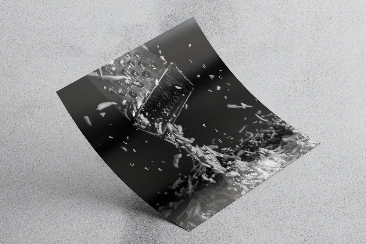
For these posters many questions and conundrums were explored. What does it mean to be grate? How does one capture the sharp (cheddar) texture in a medium that is flat? How many puns can be in one poster set? Through research and mind maps and many, many lists these questions were answered- 1. Be a grater and one is automatically grate. 2. Using different angles and zooming in and out will expose the textures in unique ways that are still interesting to look at. 3. There can never be too many puns.
There were two main takeaways from this project. The first was how to use typography and image in a cohesive way. Also picking typefaces that go with the message and feeling of the overall posters design. The second is exploring the deeper meaning behind the oject so the design decisions made have a reason behind them.