TYPOGRAPHICS
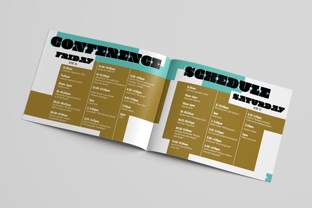
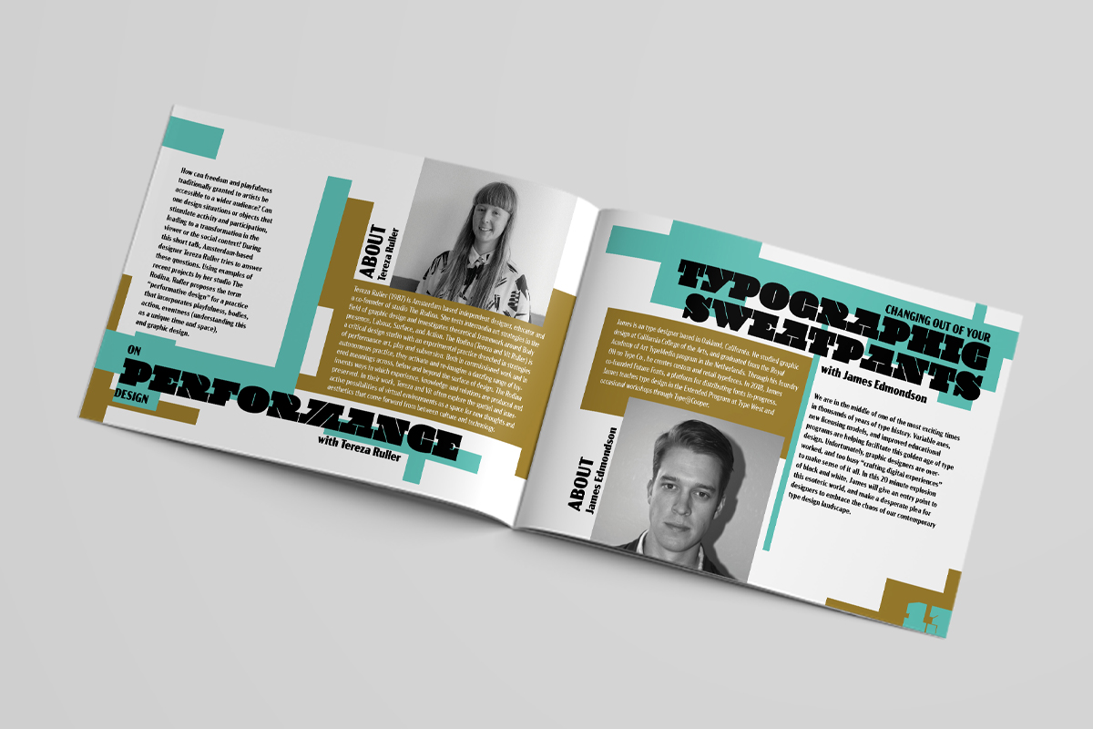
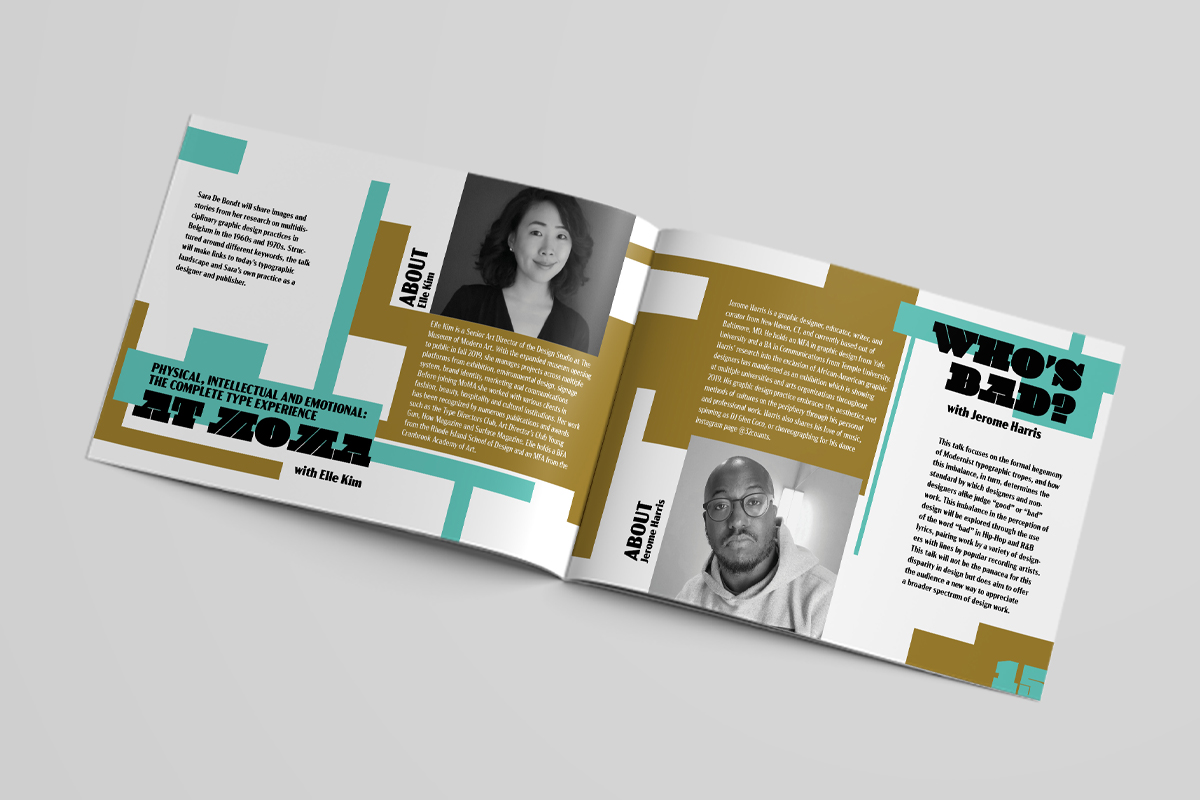
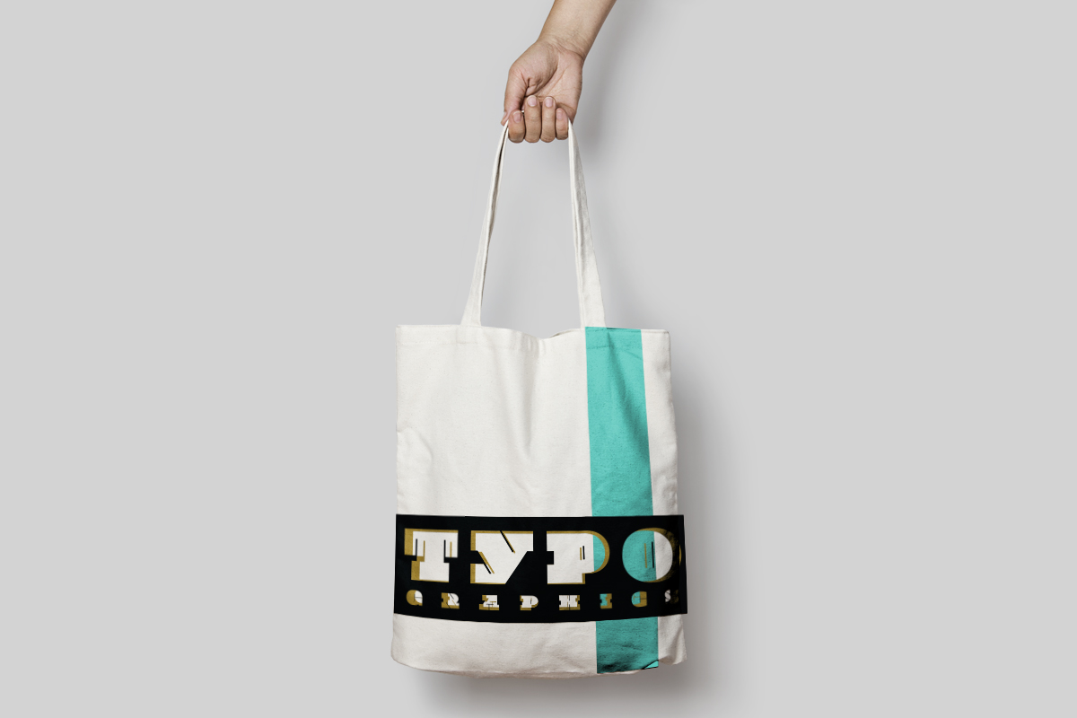
The task for this project was designing the schedule booklet, tote bag, and website for the Typographics festival. Typographics is an annual design festival for people who use type. With a conference that is all about typography, it is important to showcase interesting type decisions and a fun color palette.
In order to do that a strict grid system was used to create fun geometric designs throughout the booklet and brand. Both big and small type is used to showcase the different sizes and uses of fonts. One of the things that is truly beautiful in grasphic design is typography. The curves and edges of the letter forms, how they change and connect together. It is truly magnificent. Since those things are celebrated at this festival it was integral that the letter forms be the star of the show.
The takeaway from this project was the power of the grid. With using a grid one can still have a fun and funky layout, but make it look organized and purposeful.


